Fonts matter! Here’s how to choose them wisely

If you keep up to date with our blogs, you’ll know we like to hammer home how important design and imagery is for card designs. Well, PSA: fonts are equally important. Today, we’re looking at how to choose a font, font no gos, and the thortful creators who use fonts well. 

In short, fonts matter. Here’s how to choose them wisely… 

Choosing a font:

If you’ve decided on a design and want to pick your font, it’s worth thinking about the sentiment of the design. With so many options, it can be hard to land on a font that suits your style and brand, as well as the design. 


Our thortful graphic design expert explained that “if your designs are more floral or illustrated then perhaps opt for a more feminine/flowy font. If you’re doing really brash, rude jokes then go for something a bit more bold that compliments the sentiments”.


Whilst handwritten fonts are super on trend right now, as are the lighter calligraphy options. Have a think if this matches up with your design and the message you’re trying to convey. 

Font styles:

Some of our go-to websites for choosing a font, tried and tested by our thortful digital and graphic designers, are: 

The colour of your font is also really important. White font on a pale or pastel background is hard for the customer to read on the catalogue, and won’t print well at all. If you’re looking for some extra info on colour (specifically RGB and CMYK), take a look at our blog post on optimising designs for print.

Working well:

Let’s look at some great examples of fonts that work well.

Dolly’s Doodles has matched the whimsical font with the cute style of the card – she’s also added in a pun which ties the font and the design together even more so.

Another example is Dean Morris Cards. The rude caption is the main feature of the design and the chosen font jumps out at the reader. The font is bold and loud and suits the joke well. A caption like this wouldn’t suit a curly or more feminine font. 

Joanne Hawker

Creator Joanne Hawker explained that the font she uses is often her own handwriting. “The fonts that I use on my cards aren’t what you would describe as a typical font. Nearly all of the text you see on my cards has been drawn by hand in my own handwriting style. This makes the card totally unique to me (and thortful!) as no one else has these exact letter forms! 

The fonts that I do use have also either been created by me, or they’re a really simple serif that easily goes with my style.

It took a lot of trial, error and practise to find a style that I like and enjoy creating. Admittedly this playful style doesn’t lend itself to all card categories but there are ways to make it work by being mindful of accent colours and graphics etc. If I was to create a card which was a little more serious for example, I’d consider pairing it with a bold sans serif and tone back most of my decorative elements. I’d probably opt for a bold font as anything too thin can easily be lost (especially as we’re not printing these ourselves, we can’t easily check!)”.


Pack a Punch Designs

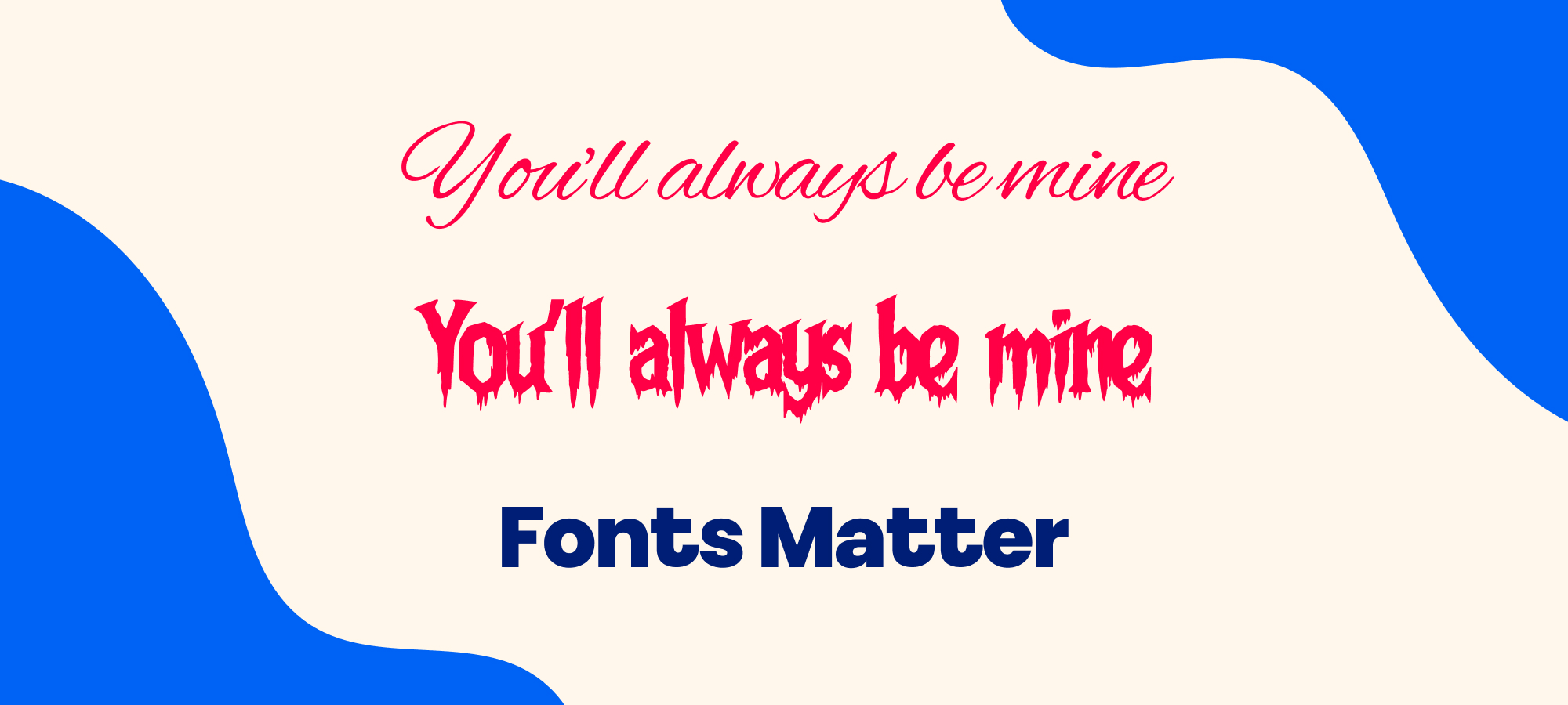
Sophie from Pack a Punch Designs talked us through her approach too: “When I first started designing cards, I would tend to stick to the same font style, but as time’s gone on I definitely experiment more. My designs range from rude to cheeky to offensive but one thing they all have in common is that they’re blunt and to the point so I avoid any cursive fonts. The main focal point of my designs is the text itself. I want customers to read the caption and, hopefully, laugh so it needs to be easy to read and visually appealing.

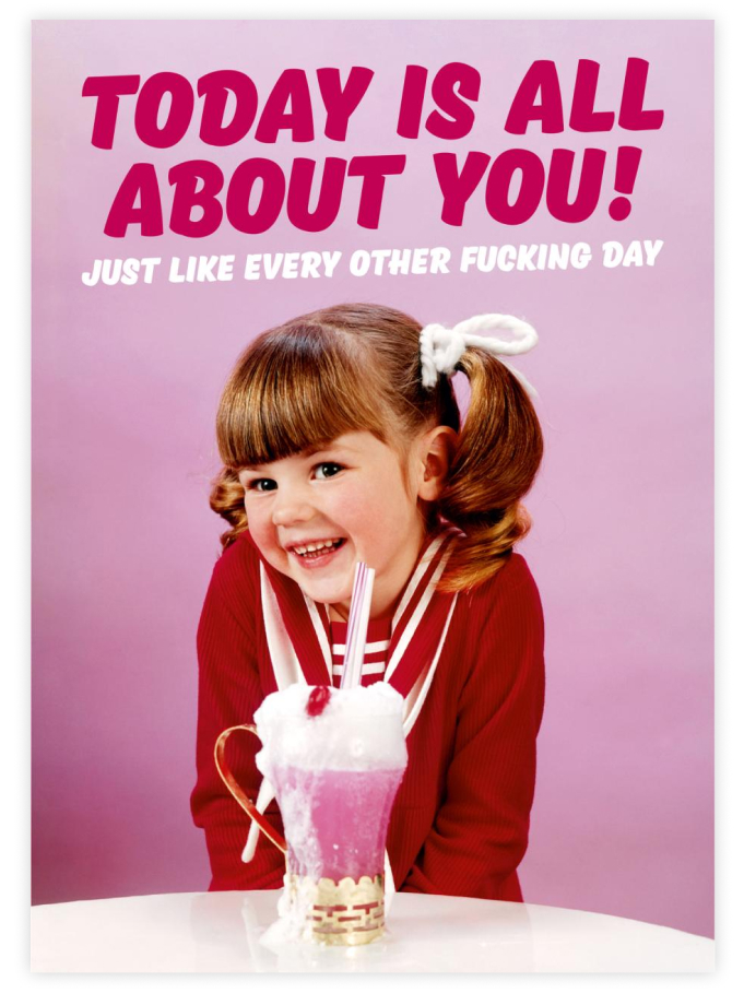
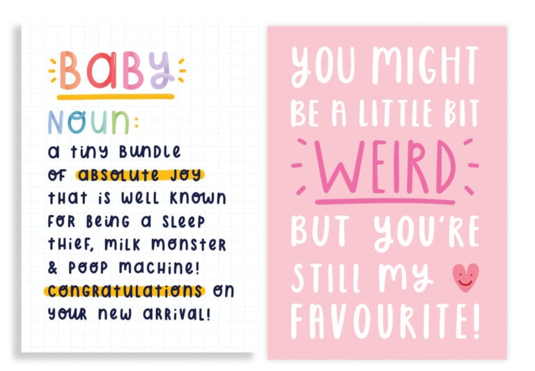
A lot of my designs are more conversational. I imagine that if you were the recipient, you would read the caption in the voice of the sender, so I like these fonts to be in more of a handwritten, casual style. If the caption is shorter I tend to use a tall, all-caps typeface, particularly if the design is on a white background.

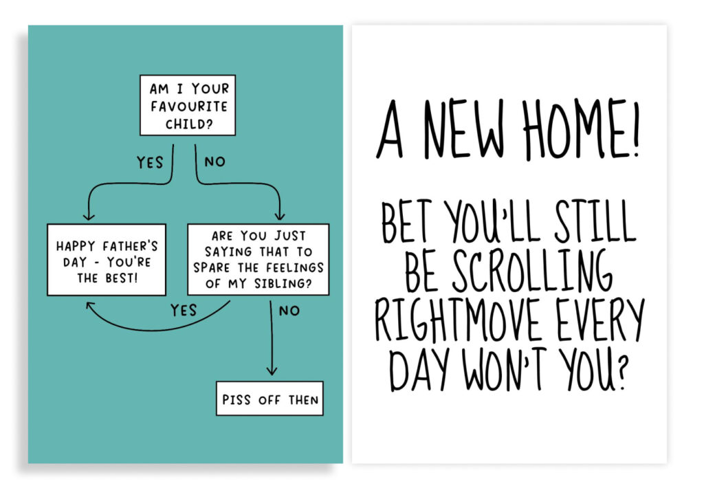
Some designs such as my flowchart cards have smaller text so it is essential that they are easy to read. I’ve changed the font on these a few times and after many years I can finally say I am happy with it. 

I am a bit of a font nerd, I have hundreds of them on my laptop. There’s been so many times I’ll think I’ve finally found the ‘dream font’, then after a few months or years I’ll discover another font and I’ll think “THIS IS THE ONE”. The joy of it is that there is an endless amount of choice (perhaps too much).” 

Font no gos:

It’s worth noting that if you’re doing long paragraphs, avoid using squiggly fonts. It can be hard for customers to read the font when they’re scrolling the catalogue – which could potentially mean losing sales!  

Even if the font you want to use matches your design and looks visually appealing, if the copy is illegible, avoid using it.  Avoid using fonts from a website where they’re listed as ‘commercial fonts’ or for personal use only, as you might have to pay for these and there could be an issue with copyright. 

Similarly if you’re choosing a font from a website, make sure it’s listed as Public Domain – this means it’s not subject to copyright and you’re free to use it. 

Whilst there are plenty of fonts out there, not every style works commercially for a card design. We have an inside joke at thortful HQ about being against using Comic Sans – however it is one of the more easy fonts to read, especially for those who have dyslexia or are neurodivergent as Sophie (Pack a Punch) advised us. Remember to not be afraid to try different fonts out there and experiment. 

We hope this helps you when designing your next card range. Get uploading your card designs now. 

Team thortful