RGB vs CMYK: How to optimise your designs for print

Hello creators! OK, let’s talk colours – specifically RGB and CMYK. At thortful, because we print in CMYK it’s important to ensure your designs are optimised, otherwise they look different on screen to how they print and leave our customers disappointed. In this article we’ll cover the basics of the RGB and CMYK colour models and how you can optimise your designs for print. 

Firstly, let’s look at the basics.

What's RGB and when do you use it?

RGB stands for Red, Green, Blue. You use RGB when you’re designing for screens (think social posts, websites and logos) because the pixels on your screen are made up of those 3 colours – we know, this was news to us as well.

What's CMYK and when do you use it?

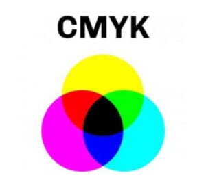
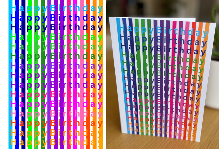
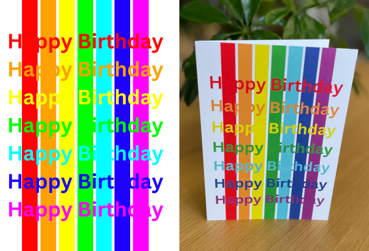
CMYK stands for Cyan, Magenta, Yellow, Black. It’s used for designs that are to be printed – as those are the ink cartridges that are in the printer. Think: greetings cards, prints, flyers, business cards. 

Yes, we know, designing in CMYK will tone your colours down a touch. But, the upside is that you’ll have a much closer match between what you see on your screen, and what the customer ends up getting – which can only be a good thing! 

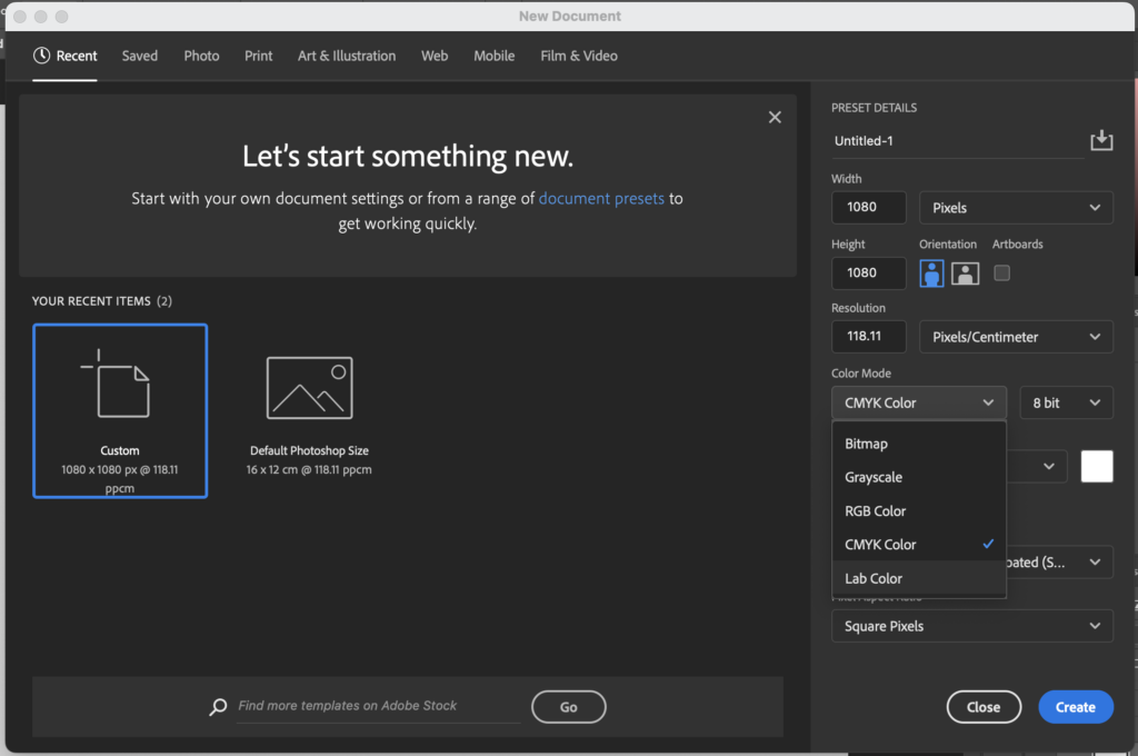
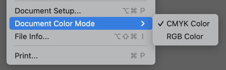
Some design programmes have CMYK mode, which will show you the true colour of your designs – in the next section we’ll have a look at how to do this.

How to check the colour mode of your designs:

If you’re working with Adobe Photoshop, you can check the colour mode of your design by:

1) Going to a new page 

2) On the right hand side colour mode 

3) Clicking CMYK colour.

Already designed your card in RGB? No drama. Just pick CMYK and it’ll auto correct your design.

If you’re working on Adobe Illustrator, you can check the colour mode of your design by: 

1) Go to file 

2) Click Document

3) Click colour mode

4) Select CMYK colour. 

Use Procreate for your designs? You can select colours using the Colour Picker tool. To access it, tap the coloured circle at the top-right corner of the screen. In the colour picker, you’ll find different colour models, including RGB. You can then use the sliders to adjust the intensity of the colours. 

It’s worth noting that designs can look different when designed in RGB compared to when they’re printed in CMYK. Below are two mock designs that show the difference between online and printed (nil points for our design skills). 


Here’s our round up of top things to remember when designing:

  • Always pick your colour mode before starting your design as in most cases you can’t change it later.
  • There’s a smaller range of colours available in CMYK, and they’re different to RGB.
  • A digital design in RGB looks different when printed in CMYK. This is because RGB is a more vibrant palette to CMYK, so your printed designs may end up looking a bit more dull”.
  • CMYK is not supported for PNG files. They get converted to RGB once exported.
  • Using fluorescent colours is a common reason for cards not being accepted into the catalogue.  

If you’re looking to create your own colour palette, we recommend trying the Coolors website. Here, you can generate a colour palette, use popular palettes and also check the contrast between text and background colours. 

Want to make sure your design always looks tip-top?

You can request a test print from us to see how the colour and design prints, using a 30% discount code. You won’t receive royalties for this, to get a test print done, drop us an email. 

Now, go ahead and get creating! We can’t wait to see your wonderful designs. If you have any questions, drop us a line [email protected]