How to stand out using fonts and design

Hello creators! Welcome back to edition three of Ask our Expert. This time we spoke to Ella, our graphic designer who explains how to stand out using fonts and design. 

Should I use large captions on my cards?

It really depends on your sentiment. If you’re saying something quite heartfelt, for example for Father’s Day, a larger caption can work well. If you want your captions to be thumb-stopping on social media and you want them to stand out in the catalogue, shorter captions are better. 

Do you know which background colour on cards sells the best?

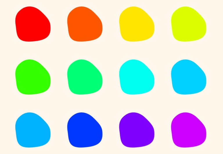
We say to explore all the colours of the rainbow! But I’d advise you try to make sure you have a really good colour contrast as that’ll make your card stand out.

If you’re looking for some inspiration for a colour palette, Pinterest is fab! As an example you could search for spring/summer colours 2023 and then translate them into your card design.

How do you choose the right font for your design?

There are obviously so many fonts out there and it can be tricky to hone in on one that you think is best for your style and brand. If your designs are more floral or illustrated then perhaps opt for a more feminine / flowy font. If you’re doing really brash, rude jokes then go for something a bit more bold that compliments the sentiments. Or, if you’re doing long paragraphs please don’t use squiggly fonts because it’s really hard for customers to read on the catalogue – which could potentially mean losing sales! 

How would you define a good quality card design?

Firstly, it has to be different. Make sure it’s something that you haven’t seen before – that’s what makes thorful so special, we have so many unique designs. Always centre your design so it’s easy to read on the catalogue, and check your colours have a professional finish. Pinterest is a great place to start when you need some inspo. 

Where can I find a good font?

My favourite place to go – and has been since I was about 15 years old – is Dafont.com. Be careful when it comes to licensing, when you search for something, ensure the ‘100% free’ is clicked to avoid any issues. My top tip is to double check when you’re in the licence that it is 100% free as sometimes it can be hidden. Another one is Google Fonts, which is great. 


What design software/equipment do you need to design your own cards?

I use Photoshop and Illustrator, which I pay for each month, however they can get quite expensive so a cheaper option would be Procreate (all you need is £20 and an Ipad). If you’re after free tools you could use Gimp or Canva, but make sure you don’t use the pre-loaded design elements on there and make your own colours and fonts.

Are there any design no go's when creating cards?

A couple of no go’s are: using colours that haven’t got contrast (like baby pink with white font), using squiggly fonts in big paragraphs of text and putting your text off of the centre of the card. It doesn’t matter if it’s left or right aligned, just make sure it sits perfectly on your card so nothing is cut off when it’s printed?

That’s all from us this time.

We hope this helped you with creating your designs. Don’t forget to check out how to make social media work for your business and how to build your brand. 

Join us next time when we speak to another thortful expert! Be sure to follow thortful creators on Instagram where the Q and As are hosted. 

Team thortful