With key seasons coming up, it’s always good to think about how you can make your next card a bestseller. We’ve shortlisted 5 tips to help you ensure your next design is a success!
1. Cards are for occasions
We know that when designing a card, it’s important to think about trends, and humour, and making it look great…but with all of this, it’s easy to forget that a card has a purpose: to send a greeting for a particular occasion!
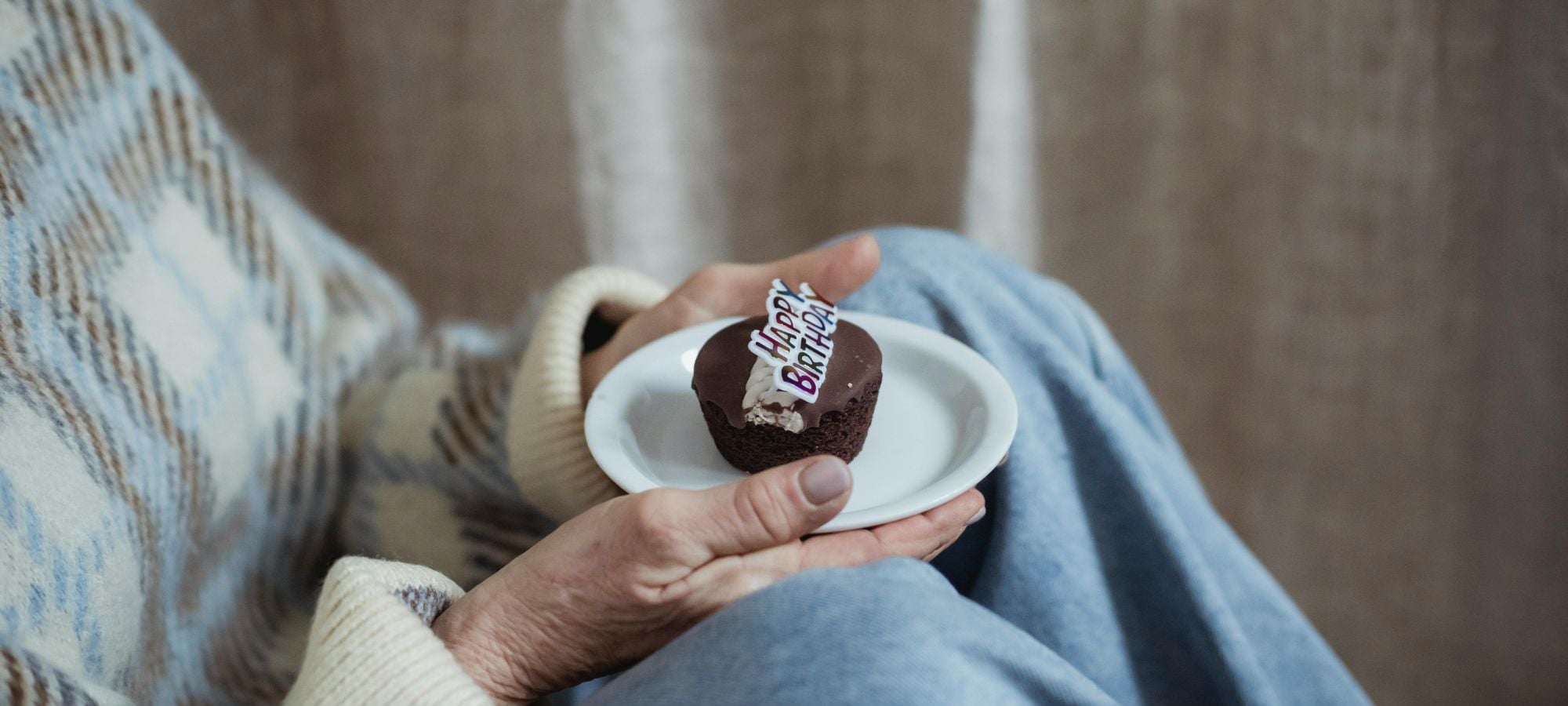
Make sure your card is geared towards a specific, card-sending occasion. It could be anything from Birthday to Get Well or Anniversary – use our categories on the site if you’re looking for inspiration! Sometimes it’s as easy as adding ‘Happy Birthday’ to a pre-existing caption: this can really help to make your card fit for its purpose, and mean that customers are much more likely to click on it.
2. Who will send it, and who will receive it?
Remember to think about who will send your card (i.e. the customer) and who they might be sending it to. What is the tone of your card? Does it suit a friend or a parent, a colleague or your uncle?
Make sure that whoever your card is designed to be from and to, it suits the relationship that it is targeted at. There is such a thing as ‘too rude’ to say to your mum, and not familiar enough to send to your friend, so think this through carefully!
3. Make it relatable
One thing we’ve discovered in our time is that cards are like memes: the more relatable they are, the more popular they are. If you can find a card which resonates with you then you’re much more likely to buy it – whether it makes you chuckle, ‘facepalm’ or blush 😉
4. Does it look good?
It sounds obvious, but the aesthetics of your card are really important! Firstly, does the style of the design match the subject matter? If you’ve got a really cheeky, lad-ish caption then ensure your design has a masculine feel – swirling hand-lettered script just won’t work!
Secondly, is your design clear enough to read at a thumbnail size? If it doesn’t look enticing enough to click on at this size then it simply won’t get chosen.
Similarly, make sure that your design has a clear aesthetic, and that it looks visually different to other cards – it needs to stand out from the crowd and jump out at customers! A mistake often made is that designs don’t look contemporary enough – it doesn’t need to be super-modern, but if the design looks dated (and isn’t a modern take on a retro theme) then it won’t get picked
5. If you’re funny, you’re in the money
If there’s one thing we Brits appreciate, it’s humour. People love something that gives them a little lift in their everyday life! Funny cards also tend to sell well – humour usually makes your card relatable after all.
Of course, there’s a time and a place for humour – no one wants a ‘funny’ sympathy card – but if you can make your card funny then it’s that bit more likely to be a bestseller!
We hope this helps you create your best design yet!
Got feedback? Drop us an email on [email protected]